The origin of Tableau and an exploration of open source implementations of The Grammar of Graphics
Inspired by the late Leland Wilkinson’s book, The Grammar of Graphics (1999), researchers at Stanford wrote a software prototype called Polaris. This prototype evolved into the first version of Tableau Desktop, and Dr. Wilkinson would go on to join Tableau in 2014 as their VP of Statistics.
The Grammar of Graphics describes an “algebra” that defines the structure of any data visualization. Decades later, this concept remains the foundation of Tableau’s design, and has inspired an array of open source projects.
Polaris
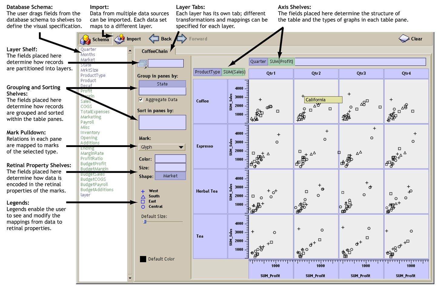
The Polaris research paper was published in 2002. Authored by Chris Stolte, Diane Tang, and Pat Hanrahan, the Polaris project described “a System for Query, Analysis and Visualization of Multi-dimensional Relational Databases.”
Here is a screenshot of the Polaris UI from the paper:
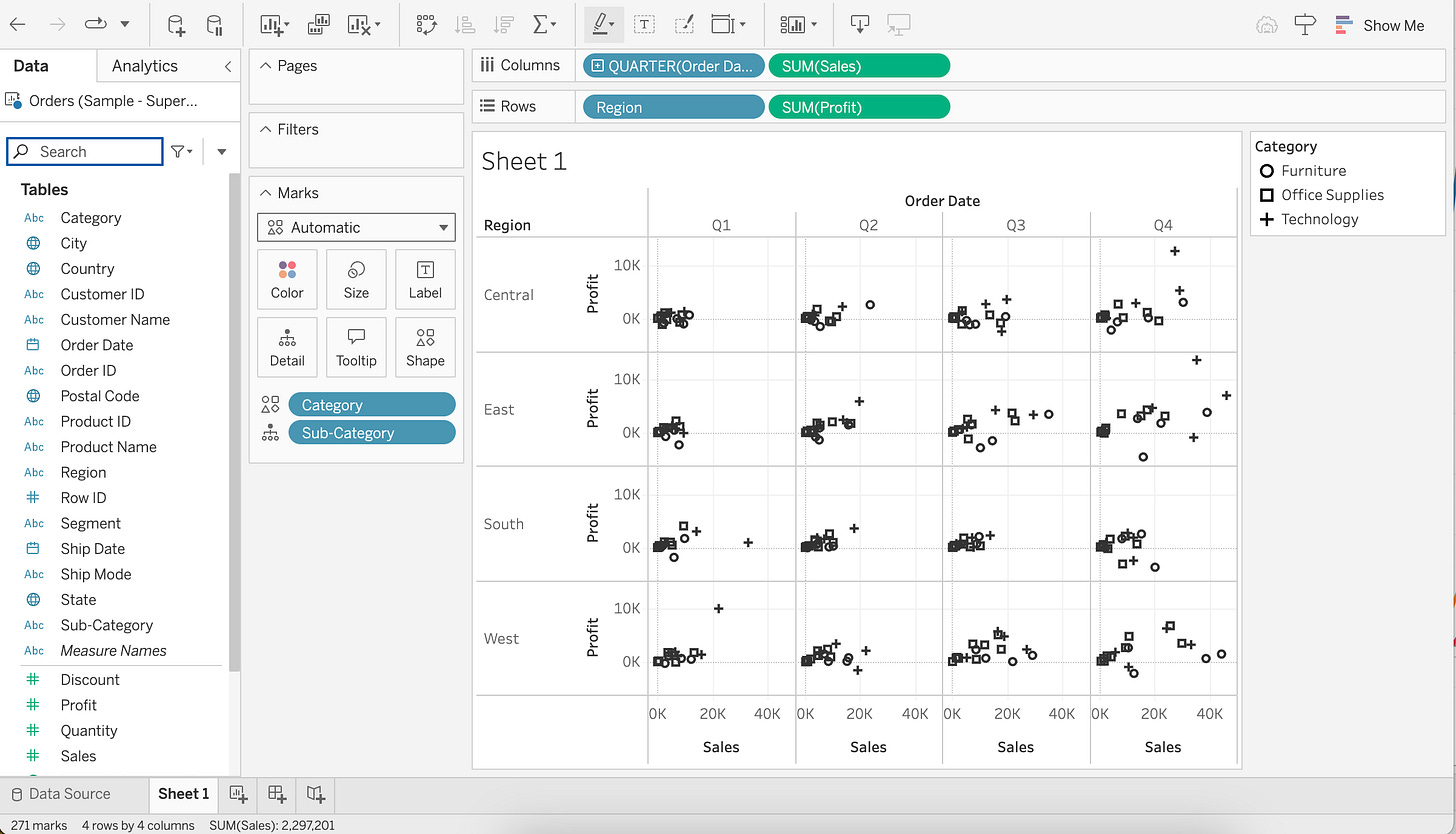
This research paper was the springboard from which Tableau launched. Polaris evolved into Tableau Desktop and fast-forward 22 years, and here is what the Tableau UI looks like today (2024):
Tableau, the company, as well as the data analytics landscape has changed dramatically over the past 20+ years, but the core UI/UX has remained a constant.
If it’s not broke, why change it? 45 years later, Microsoft Excel still resembles the the original Visicalc from 1979:
But this post isn’t about spreadsheets or tables, so let’s move on.
Outside of Tableau, where else is this VizQL or Polaris-like UI/UX used?
Vega and Voyager
Vega, Vega-lite, and Voyager are open source projects maintained by the University of Washington.
From Wikipedia:
Vega and Vega-Lite are visualization tools implementing a grammar of graphics, similar to ggplot2. The Vega and Vega-Lite grammars extend Leland Wilkinson's Grammar of Graphics by adding a novel grammar of interactivity to assist in the exploration of complex datasets… Vega is used in the back end of several data visualization systems, for example Voyager.
Vega and Vega-lite define JSON specifications that are used for making visualizations:
Notice in the example above, the Vega-lite specification defines the following:
Mark: “point”
X : Horsepower, quantitative data type
Y: Miles_per_Gallon, quantitative data type
You could create the exact same visualization in Tableau. The only difference would be Tableau would refer to X and Y as rows and columns.
If you look at a screenshot of Voyager 2 (pictured below), you can see a Tableau-like interface where the user drags fields from the left hand “Data Pane” onto shelves labeled “X”, “Y”, and “Marks” (with various encoding options for size, color, shape, detail, and text).
Interestingly enough, Tableau’s recent Pulse product also uses Vega/Vega-lite specs behind the scenes.
Graphic Walker and PyGWalker
Graphic Walker and PyGWalker are open source systems that have come out of Hong Kong University and a young company called Kanaries.
Their Github page describes the system as follows:
Graphic Walker is a different open-source alternative to Tableau. It allows data scientists to analyze data and visualize patterns with simple drag-and-drop / natural language query operations…
A grammar of graphics based visual analytic user interface where users can build visualizations from low-level visual channel encodings (based on Vega-lite).
The UI/UX is almost identical to Voyager and the original Polaris design.

Graphic Walker also has a Python implementation for embedding their UI directly into a Jupyter notebook. This is called PyGWalker
PyGWalker has a corresponding research paper that explains the system in detail. Below is a screenshot from this paper:
ggplot2
ggplot2 is an open source R package for data visualization. From the ggplot2 book:
ggplot2 is an R package for producing statistical, or data, graphics. Unlike most other graphics packages, ggplot2 has an underlying grammar, based on the Grammar of Graphics (Wilkinson 2005), that allows you to compose graphs by combining independent components. This makes ggplot2 powerful. Rather than being limited to sets of pre-defined graphics, you can create novel graphics that are tailored to your specific problem. While the idea of having to learn a grammar may sound overwhelming, ggplot2 is actually easy to learn: there is a simple set of core principles and there are very few special cases. The hard part is that it may take a little time to forget all the preconceptions that you bring over from using other graphics tools.
esquisse is the name of a ggplot2 extension that provides a GUI for creating visualizations with ggplot2. In esquisse, the user drags-and-drops fields to create a visualization and their actions also generate ggplot2 code.
Here is a screenshot from their Github page:
Notice once again the use of X, Y, and Marks. In this case:
flipper length on X
bill length on Y
Mark type set to “point” with species on color
Closing thoughts
Whether implemented through proprietary software, open source software, GUI’s, or code, The Grammar of Graphics has had a profound impact on how people around the world work with data.


