Explainer series: Tableau
An attempt to break down the mechanics of how Tableau works
Tableau is a tool for retrieving data from a database and rendering it as a visualization.
How does Tableau query your database?
Actions that you take in Tableau are translated to SQL1, the language that databases speak.
When you drag database fields to different locations on the Tableau interface, a query gets sent to the database, and the results are visualized — in this case as a small multiples bar chart:
As you include more fields in the view, Tableau will update the query sent back to the database. You will never explicitly see the SQL query that Tableau writes unless you use the Performance Recorder, feature which lets you look under the hood at the queries being sent.
Before we talk about how Tableau visualizes our query results, we need to define a few terms.
Defining Granularity, Dimensions, Measures, and Marks
Granularity: the granularity of data tells you what one data point represents. The underlying data is the most granular, as it has not been aggregated in any way.
The query that Tableau sends to our database produces a response called the result set. This result set is less granular because it has been aggregated (i.e. rolled up). If you’re familiar with Excel, the result set is like a pivot table. Let’s look at a non-visual text table to illustrate this:
Dimensions and measures: every field in our database becomes a dimension or a measure in Tableau. Dimensions are categorical fields (e.g. ID’s, names, dates, etc.). Measures are quantitative fields that we want to apply an aggregate function to (e.g. sum, avg, max, min, etc.).
Marks: each data point in our visualization is called a mark. How many marks we have in the visualization depends on the granularity of the result set we’re visualizing, as well as any filters that we have applied.
Note, in the bottom left hand corner of Tableau, there is a (barely noticeable) indicator that shows how many marks we have in our result set.
Now that we’ve define these terms, let’s look at how Tableau visualizes our data.
Anatomy of a Tableau Visualization
By dragging dimensions and measures to the rows shelf, columns shelf, and marks card, you can produce a variety of visualizations. Each time you drag and release a field, a query is sent to the database, and the visualization is updated, providing you with immediate feedback2.
Rows and Columns Shelves
The Rows and Columns shelves create the scaffolding of your visualization by creating axes (either discrete bins or continuous axes). The dimension fields you use also set the granularity of your visualization’s result set.
To get a feel for how this system works, experiment with swapping the rows/columns, reversing the order of the fields, and adding/removing dimensions or measures.
Marks card
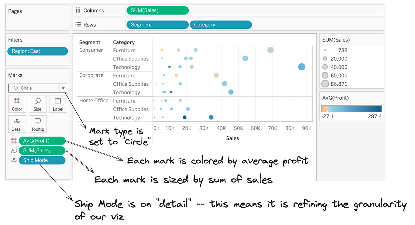
The Marks card allows you to further control the granularity of your visualization, specify the mark’s visual encoding (e.g. bar vs scatter vs line), and apply additional customizations to your marks (e.g. color, size, labels).
I also recommend experimenting with the marks card, but I will demonstrate how some of these controls work with a couple scenarios:
Let’s move “Ship Mode” to detail and add 2 measures to the marks card:
Now let’s make changes to the rows/columns shelves and the marks card to see how they work in tandem:
Wrap-up
I hope this post helped you understand the foundations and mechanics of Tableau.
If you have any feedback on this type of explainer post, I would love your comments.
Tableau can connect to SQL Databases, flat files, and API’s — not all of which speak SQL but at its core, Tableau is a SQL engine.
Pending performance of Tableau and your underlying database


